Cash for My Vehicle

  • Car trade-in service app - UX project for Martini Media Group

Project Goals

Help a startup client build and design their car trade-in service.

Interview Stakeholders

Establish project goals and values; introduce user feedback loops; understand key use cases and personas

Synthesize MVP Flows

Generate a basic pathway through main tasks, including back-office management; establish a brand and style guide

Prepare for Dev Estimate and Build-out

Frame data and UI needs for architecture and front-end scoping; provide mocks and assets for consumer and back-end experience

Kickoff

While working at Martini, design was involved from the very beginning of the project. UX and Market Research were crucial to understanding the business viability of the concept and how to target the experience. We designed this app with a 2-person UX team and one part-time freelance designer, planning for our team of 2-3 remote devs.


Martini Media Group had a repeatable project template used to generate an MVP app design for a startup business still exploring their user bases, billing model, and branding concepts.


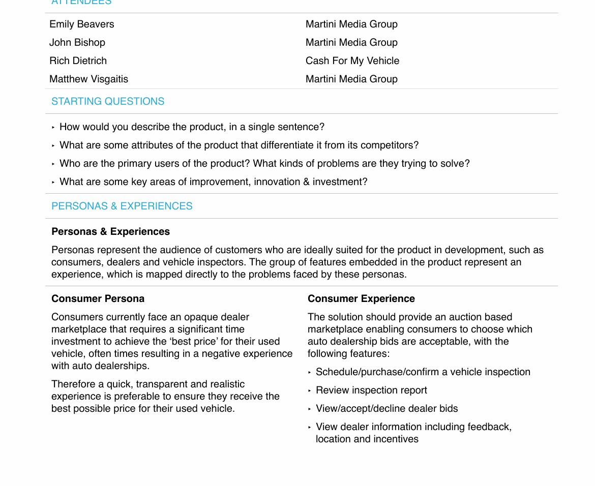
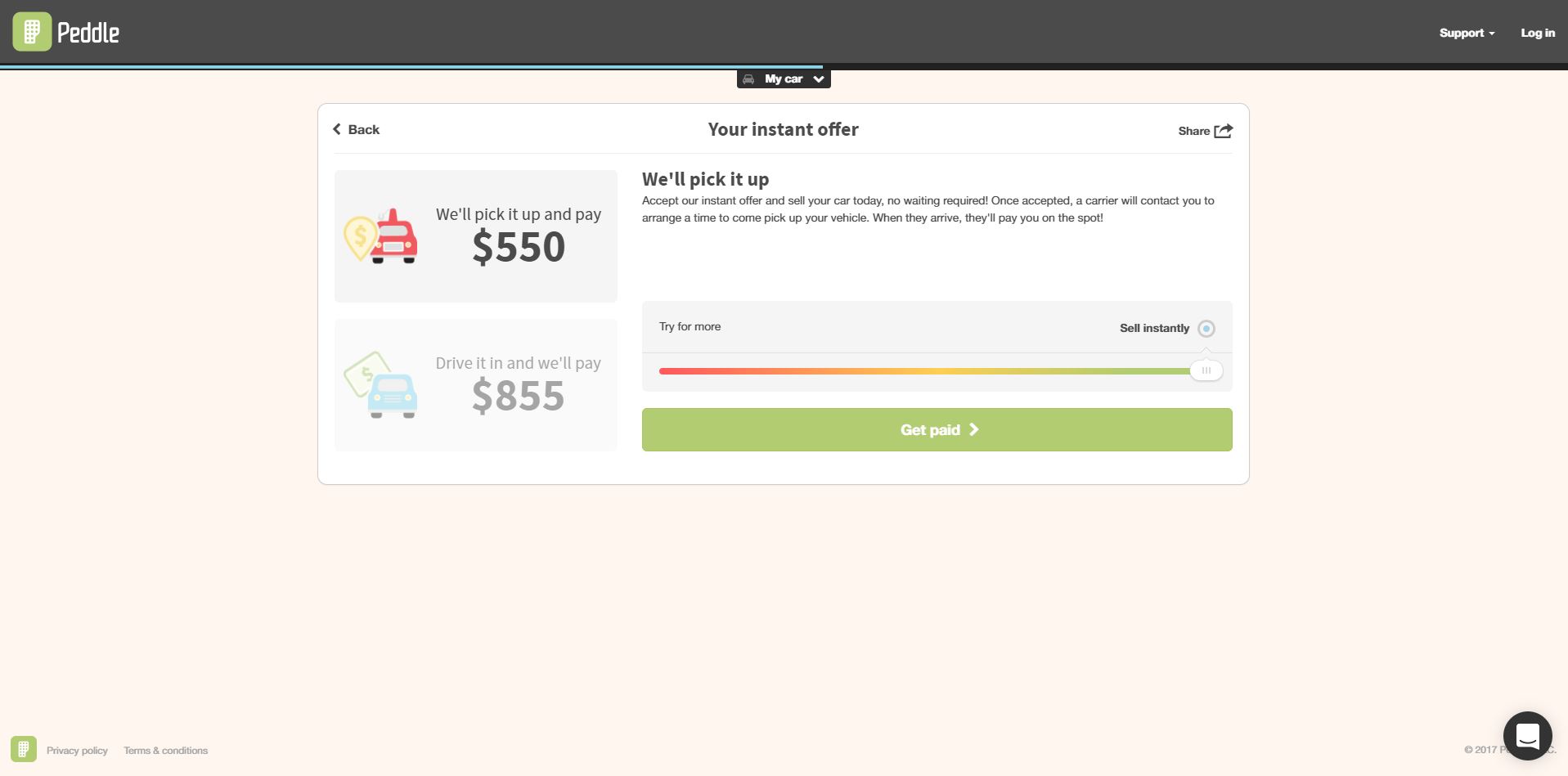
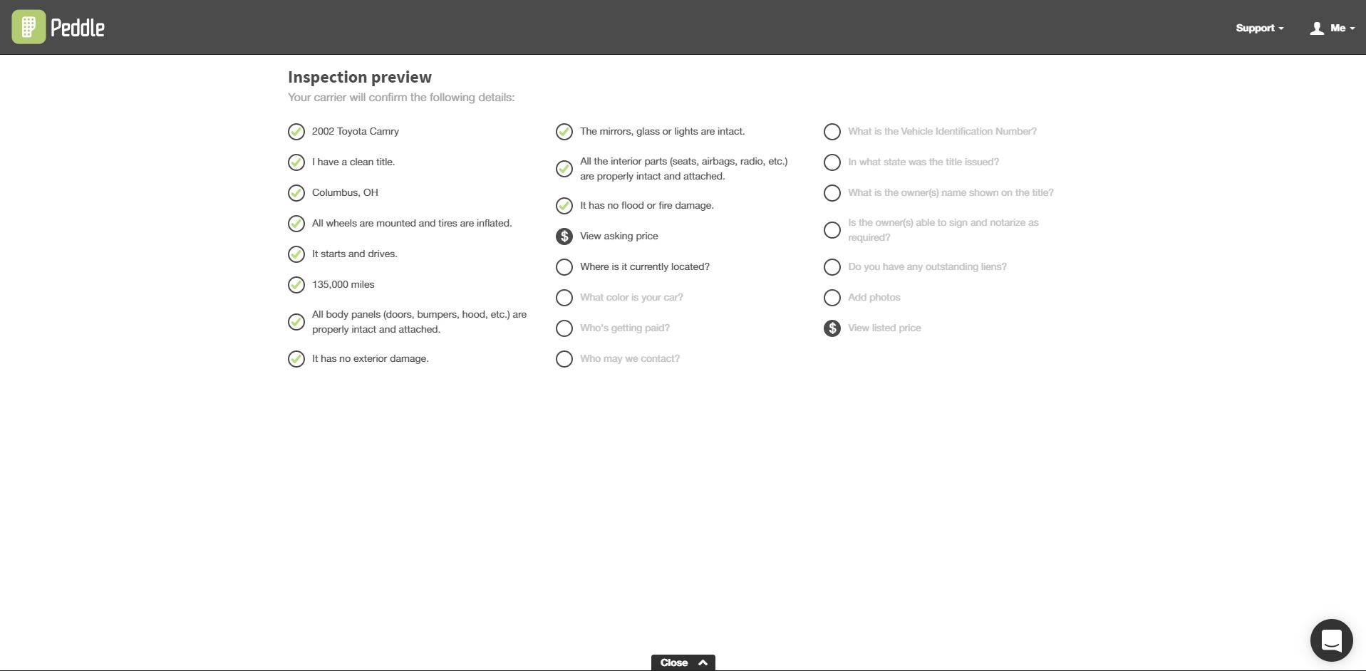
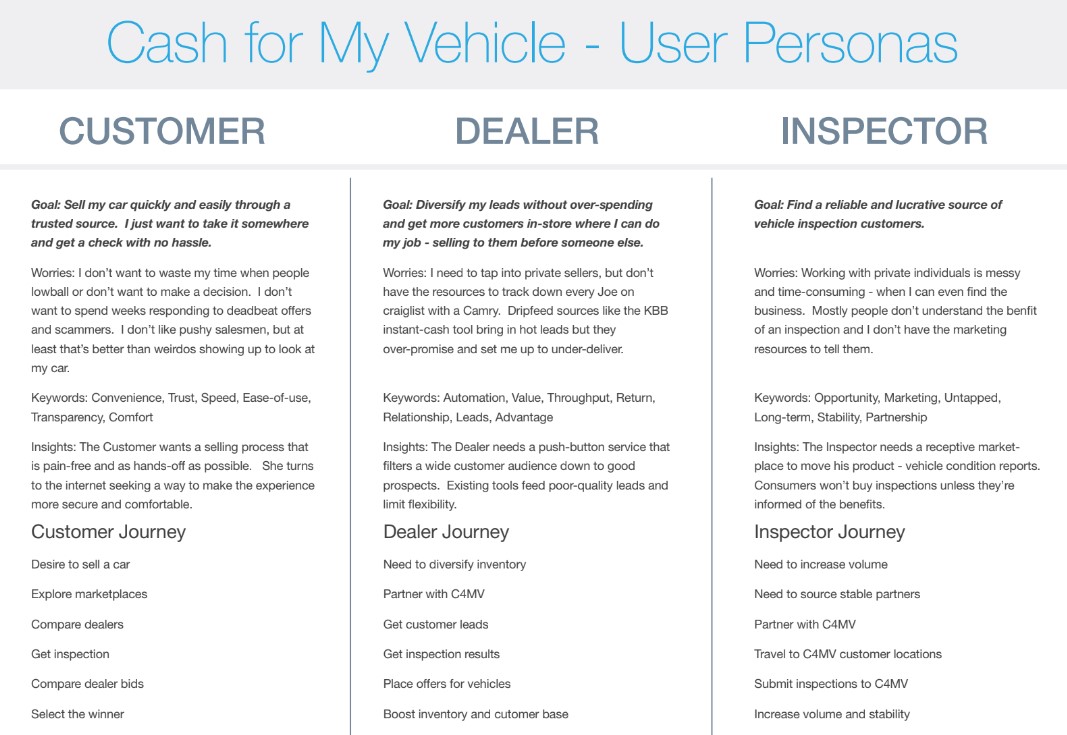
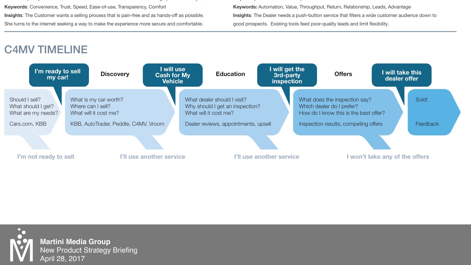
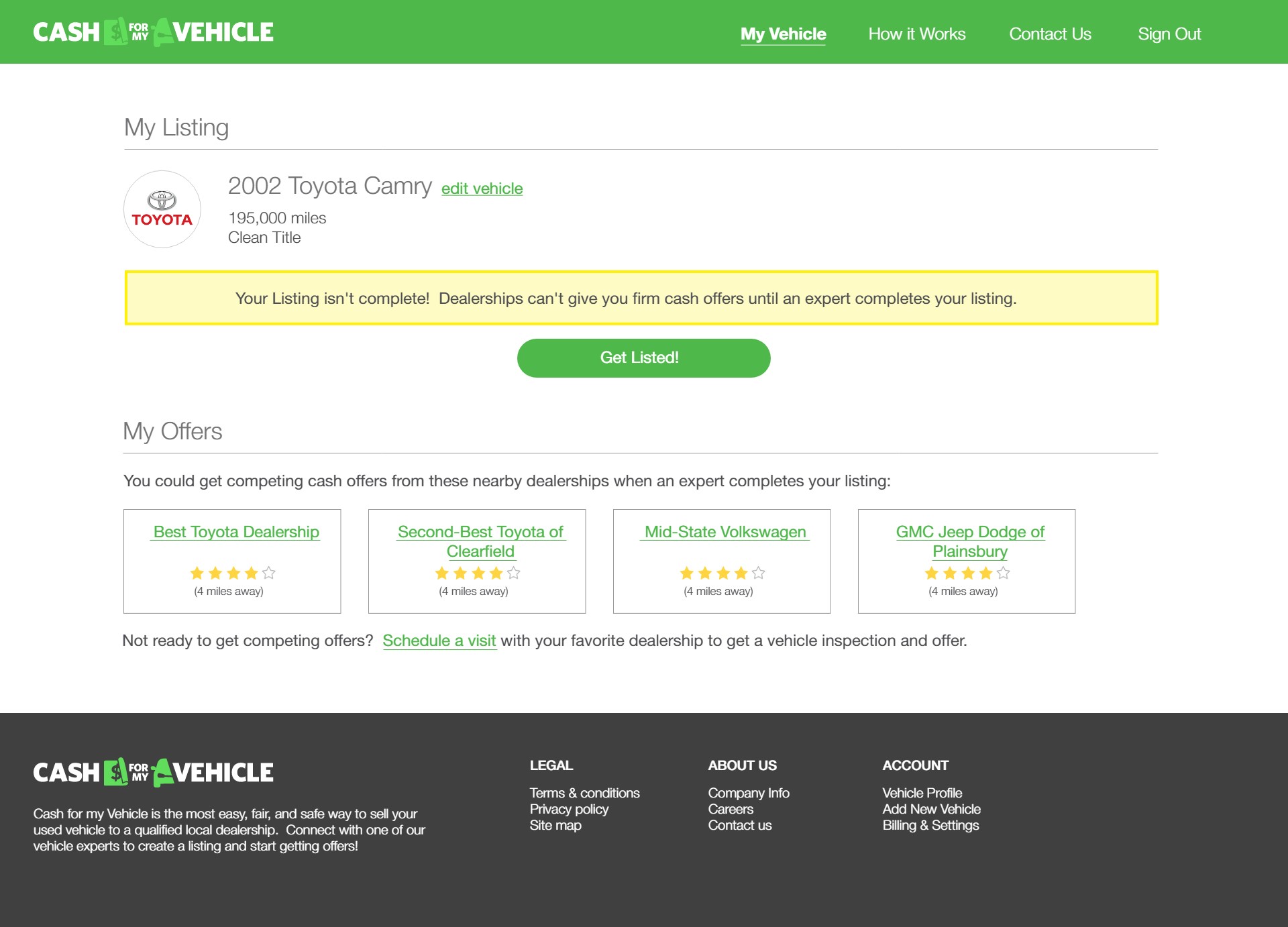
The premise: selling your used car sucks. Dealerships don't want to drive sellers away, but they have to lowball you to cover their risks. However, a secret hack fixes that - when they sell to each other, dealers rely on 3rd-party inspector reports  to get an accurate read on the condition and value of a car.  If consumers could interface with the network of inspectors, they could get a fair value for their car  - and even comparison-shop dealerships against each other! Not that dealers would mind, because the inspection report would give them confidence to make good offers.

Insight: Often the design challenge is not creating a new solution, but creating a pathway to overcome awareness and accessibility barriers to existing solutions.

Competitive Research

Cash for my Vehicle would not be the first business concept to let customers easily sell a used vehicle; to help establish the market niche for C4MV I led the competitive research effort.

The competitive advantages data I assembled would later be re-purposed for marketing and consumer surveying.

Personas and User Journeys

We explored tailoring web experiences for 3 personas initially - a consumer, a delearship employee, and a 3rd-party inspector. Working through their needs, we were able to establish that the inspector experience was lower-priority or could be managed outside of the web app.  This simple, short UX research exercise allowed 1/3rd of the MVP scope to be trimmed.


Descriptions and overall goals

Adding details: Keywords, Insights; personification

Timeline of user decisions

Insight: Identifying user groups early isn't just about who gets what features, but when.

User Research

With a basic idea of the steps a customer would need to go through and an audience profile, I drafted a survey for the C4MV team. For this project time was tight, so I would continue on to early UI while C4MV worked on collecting survey responses from their dealership customers and associates. The goal: to validate the assumptions about user values, steps in the user journey, and overall market appetite for the C4MV-style solution.


We had poor survey response rates when relying on the client partner to conduct the research, and had no way to be confident in their methods or candidate slection. Ultimately they only collected a small sample and stopped collecting when they initially heard positive feedback. It would have been better to leverage a polling tool to reach a wider audience or conduct guerilla research with other dealership, repair, or social media sources.

Insight: Don't assume the client has surveying experience or a neutral interest.
Coach them on UXR practices or do it yourself.

UI - First Draft

While waiting on the consumer survey data to come back, I was tasked with adapting an early mobile devices design sketch to some mocks of what the responsive web UI could look like.  In hindsight, this step should have been low-fi; wireframes with no visual treatment.  Despite pressure to give devs and the client something "polished" for appraisal, we had no brand identity for C4MV at this stage and core interactions were still unvalidated. Since this would primarily be about roughly mapping what UI elements were needed in what steps of the flow, it would have been easier to make changes down the road without this version of the site "set" in our minds.

Early drafts of the UI concept were based on existing major competitor sites. If users cross-shopped, the newer and less-established C4MV would look and feel similar. As a B2C tool, the small central container would allow easier responsive layouts for varying viewport sizes.

I adapted the desktop version from our original mobile wireframes, but we ended up re-working the flow of user signup and opting for different interaction choices in the end.
Treating the desktop view as a unique problem would have taken more time, but would have resulted in less re-working later.

Insight: Rushing to high fidelity can be counter-productive.

Branding + Refinement

Our client took a pause on the project after our first drafts of the consumer flow; the next sprint would be a branding exercise to establish more of the values, messaging, and visual identity of "C4MV".

I led the visual identity effort with some quick logo, colorway, and high-fidelity mobile view examples to help establish the look of the brand.

The "Highway" style was selected, and my design compadre and I started updating the existing flows with more high-fidelity polish.