- Portfolio
- VIDAPAY MARKETPLACE
Users are buying phones from us once but not
sticking around.
What’s wrong, and how can we fix it?
Visual Refresh
Everyone agreed a styling and UI consistency update would be good for user engagement.
Identify Process Improvements
I volunteered to find out why buyers weren't staying with the handset-buying program.
Originally, the project scope was:
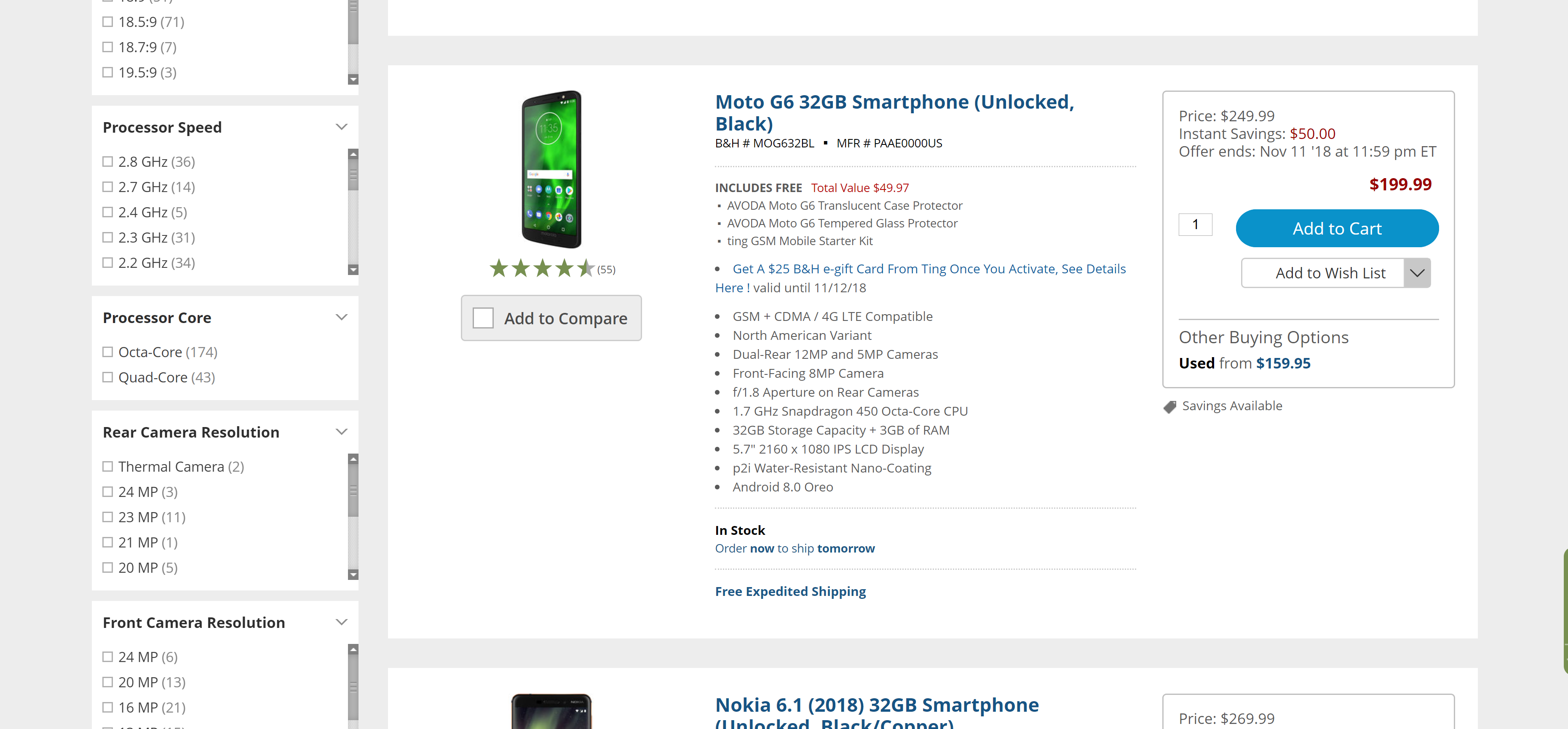
Redesign efforts would center on the existing e-commerce backbone -- product pages and product catalog. Here's what the Marketplace looked like to start with:
To understand what we were working with I decided to collect
some complaints.
Even if the fix business leadership
wanted would manifest as simple UI changes, I would need to
understand what business and user rationale was at the root
of the problem. I worked my way around the entire office,
collecting input team by team.
What research methodology can we maximize in only a few days?
Since the entire project - design and development - was
initially scheduled for 30 days, there wouldn't be a
substantial amount of time to dedicate to UX Research.
Rather than do a lot of competitive benchmarking or seek
qualitative feedback by screening, interviewing, and
analyzing, I would have to lean on quantitative tools.
What did we learn?
#1 User concern: The cost of the phones.
Users did not understand the rebate pricing system.
The main pain point was in phone pricing. T-CETRA's
unique product strategy was to offer rebates on
phones - subsidized by phone carriers.
Users would have to very clearly conceptualize the
"after rebate" costs to find value in the T-CETRA
e-commerce platform, and the survey responses made
it clear this information was not getting through.
Many first-time buyers were frustrated with missed
or misunderstood rebates.
Along with the rebate pricing, there was a major issue understanding Carrier Compatibility.
It was far too easy to buy a phone that would not work as anticipated.
Since most rebates depend on the phone being activated on a specific carrier, this challenge furthered the problems of users buying a phone and not earning the rebate. Even users who felt they had a good grasp on the carrier and network situation could easily mistake identical phones with different carrier compatibility after purchase.
User feedback, existing team complaints, and examination of the current UI all helped me establish design priorities.
1. Make the carrier-specific rebates and compatibility
loud and clear.
2. Make everything else invisibly default.
We had a couple of clearly-identified issues to address; I decided the best way to keep our design tightly-focused on solving those while meeting our deadlines would be to lean into Jakob's Law and make the rest of the e-commerce experience as vanilla as possible. We could save a lot of design and build effort by relying on familiar and functional B2C e-commerce patterns.
I started on paper and moved into basic layouts in Adobe XD.

Defining main page features
The main pages - Catalog and Product Detail - were the focus of the redesign. We referenced some comeptitive B2C or B2B e-commerce examples where we knew (courtesy of previous user feedback exercises) that our customers also shopped: eBay, bestbuy, B and H, tgwireless, b-stock, wholesale closet, etc.


Removing the "add to cart" option from the catalog view let us focus on communicating the highest-priority information.
At this stage I made the call to break from established
UI patterns and remove our existing "Add to Cart" from
the catalog preview. The decision was contentious with
our business stakeholders and goes against basic UX
principles of removing hurdles to a desired action - but
in this case the easy-buy option was contributing to bad
experiences and buyer abandonments.
Users would only get the highest-priority information in
the catalog product preview: Name, Main Image, Price,
Rebates, Carrier Compatibility. Trying to offer color
selection, tech specs, or rebate fine print in the
catalog preview would only add clutter and distraction.

From the starting point of the competitor references each progressive iteration in the product listings moved towards simplifying and clarifying the 3-4 crucial elements for users to see and understand. We cut out all extraneous text and detailed product information.
We established a set of constraints for pricing, carrier compatibility, and other information. Each would get a column in the desktop layout to keep the search results page scannable. This layout re-used the color-coding for carrier compatibility that our Marketing team had introduced as a stopgap fix in the older e-commerce site. Stacking the tags would let users see at a glance if a phone was compatible with their intended carrier, and if there was a rebate on that carrier.
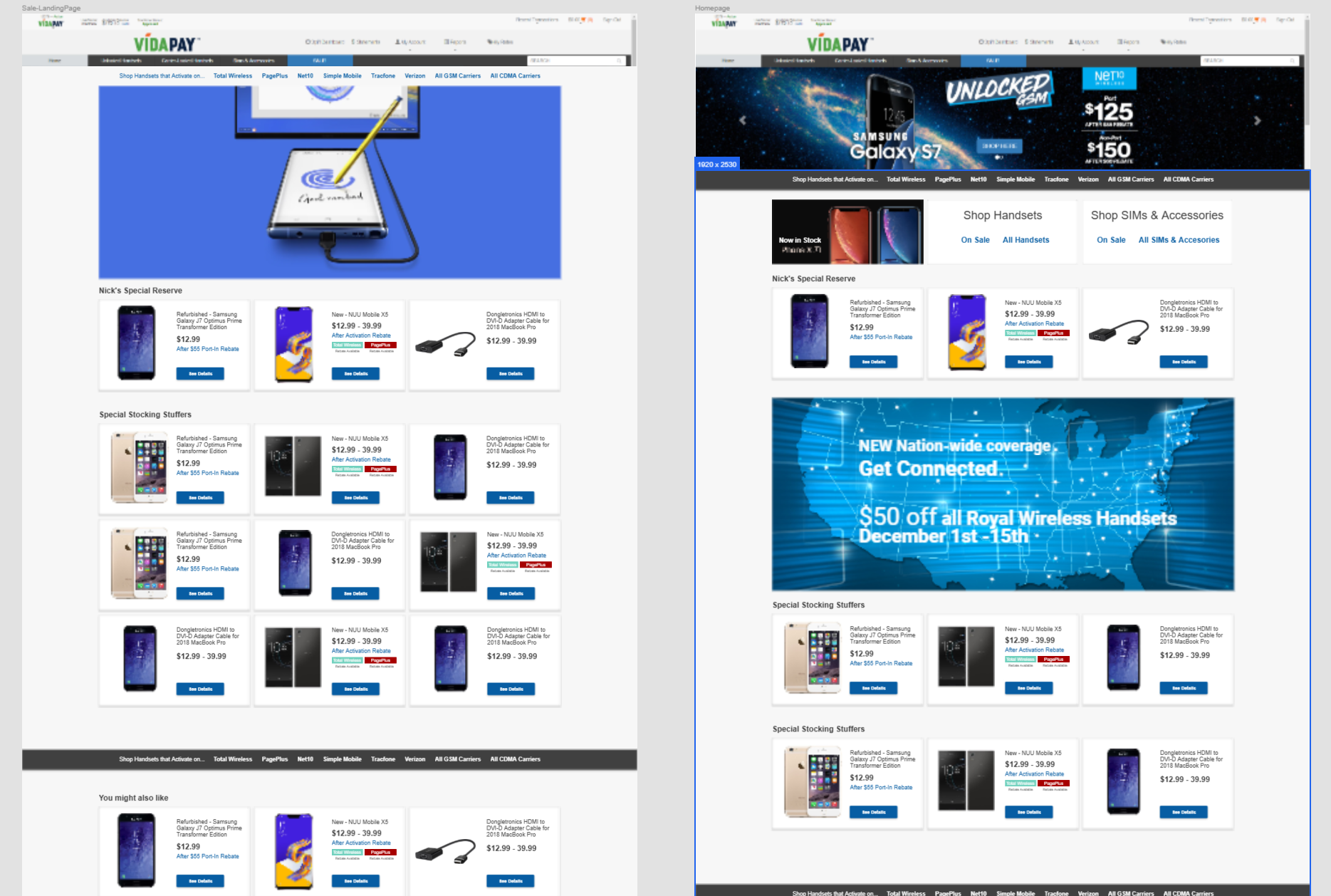
The original Marketplace design had no landing page or shortcuts to help narrow down the catalog view into relevant sub-groups. Once we had a formula for how to represent products in the catalog, we put together a condensed version that could be used to populate suggested shopping clusters.
Product Pages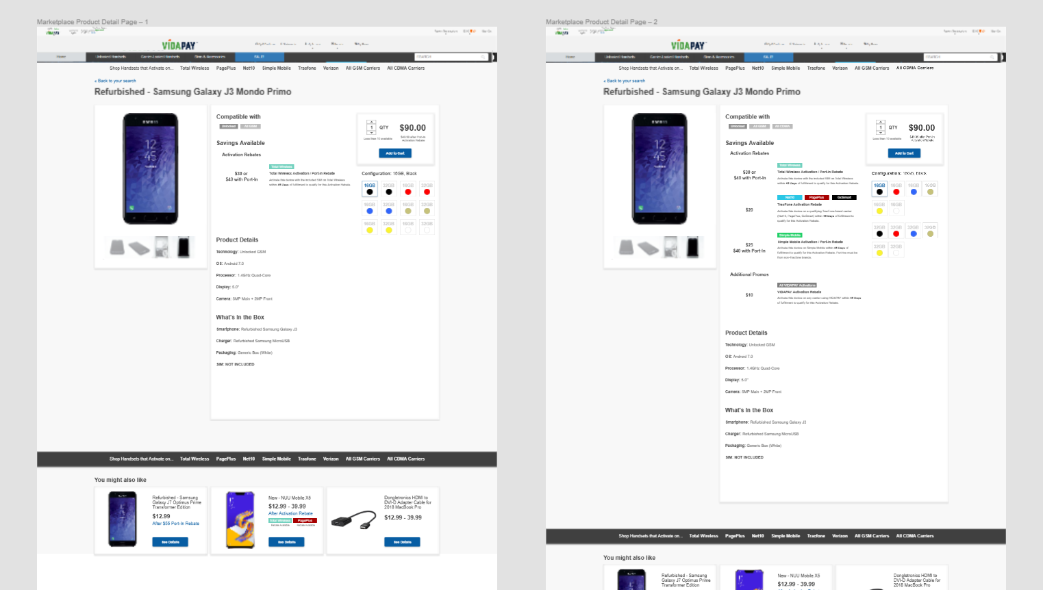
Early mocks for the product page - "Compatible With" and "Rebates" are at the top, with tech specs and other details de-prioritized. Rebate information is clearly spelled out. The right-hand product options and quantity picker would see more revisions.
With signoff on the initial mocks, business leadership was
convinced to expand the project scope and refactor some of
the backstage systems of Marketplace. I took advantage of
the extended project timeline to validate our assumptions
with a round of remote user tests.
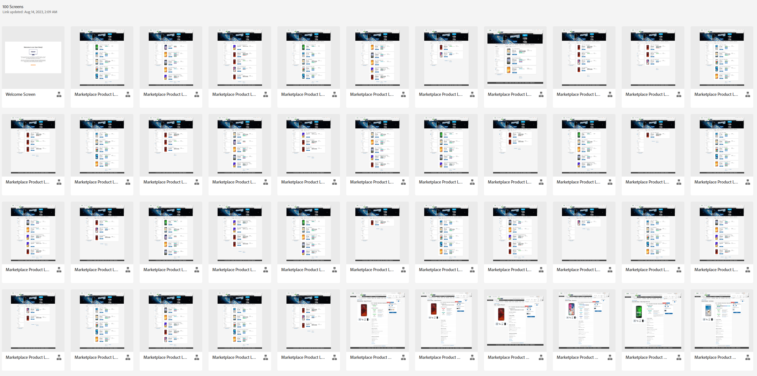
I opted to structure the tests as a propmted series of
typical buying tasks. In order to give test participants
a works-like environment to explore, we assembled a
100-screen "megamockup" to create a browsable catalog
with a mixture of real and simulated product data.
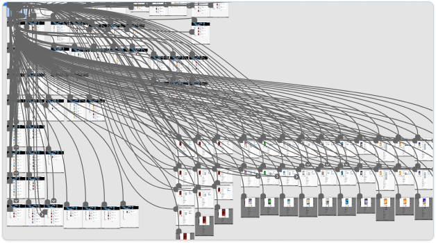
Business leaders were initially not convinced we would
need a round of validation testing - if we already had
the mockups, wasn't design already done? I successfully
pitched the concept to the e-commerce director, who was
the most invested, and we worked together to find some
phone inventory to use as participant compensation.
User Testing Findings
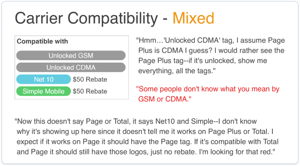
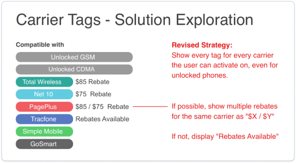
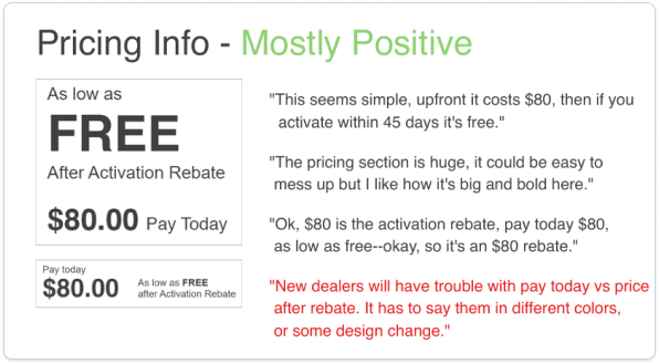
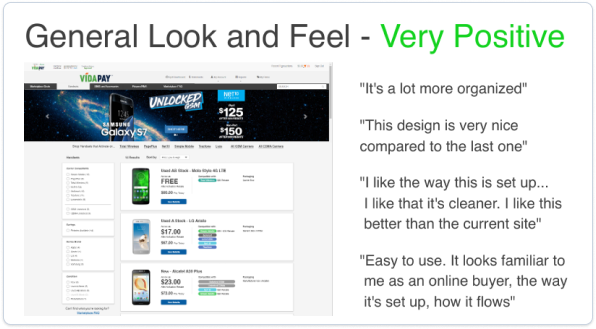
Testing was extremely productive and successfully validated our design direction.
Participants were generally able to complete tasks
fully and easily; we found that they were answering
many of their own questions with information
provided in the UI and were able to draw accurate
and complete conclusions about the pricing, rebate,
and carrier compatibility of the products.
We
got good feedback on the "clean" look and feel
update, and users commented that they felt it was
"familiar" and "easy to use" - exactly in line with
the design objectives.
After our round of user testing, we finalized a design MVP and prepped for development handoff.
Handoff Files
Previous practice at T-CETRA had largely been to hand
over flat files (PSD or InDesign) to front-end
developers, or to specify components from a framework
(Bootstrap) with desired changes.
Since I had
shifted the design software to Adobe XD, we were eager
to test the "dev mode" export. I worked with the dev
leads and project manager to establish a documented and
updatable system of sharing XD links for dev handoff.
 Generally I worked with two files - one clean visual
reference, and one annotated for QA and dev reference,
exported with dev mode, and supplemented with additional
spec documents when possible. Link exports would be
versioned and annotations kept to the changes in the
most recent version so we could track where gaps in
communication or limit scope to specific changesets for
dev sprints.
Prior to the new Marketplce design being implemented, I
worked with our Front-end lead and Architect to
establish a new set of evented behaviors in Azure App
Insights.
 With these in place we were able to track the last ~60
days of behavior on the old Marketplace design and
measure UX and Dev KPIs when the new design launched.
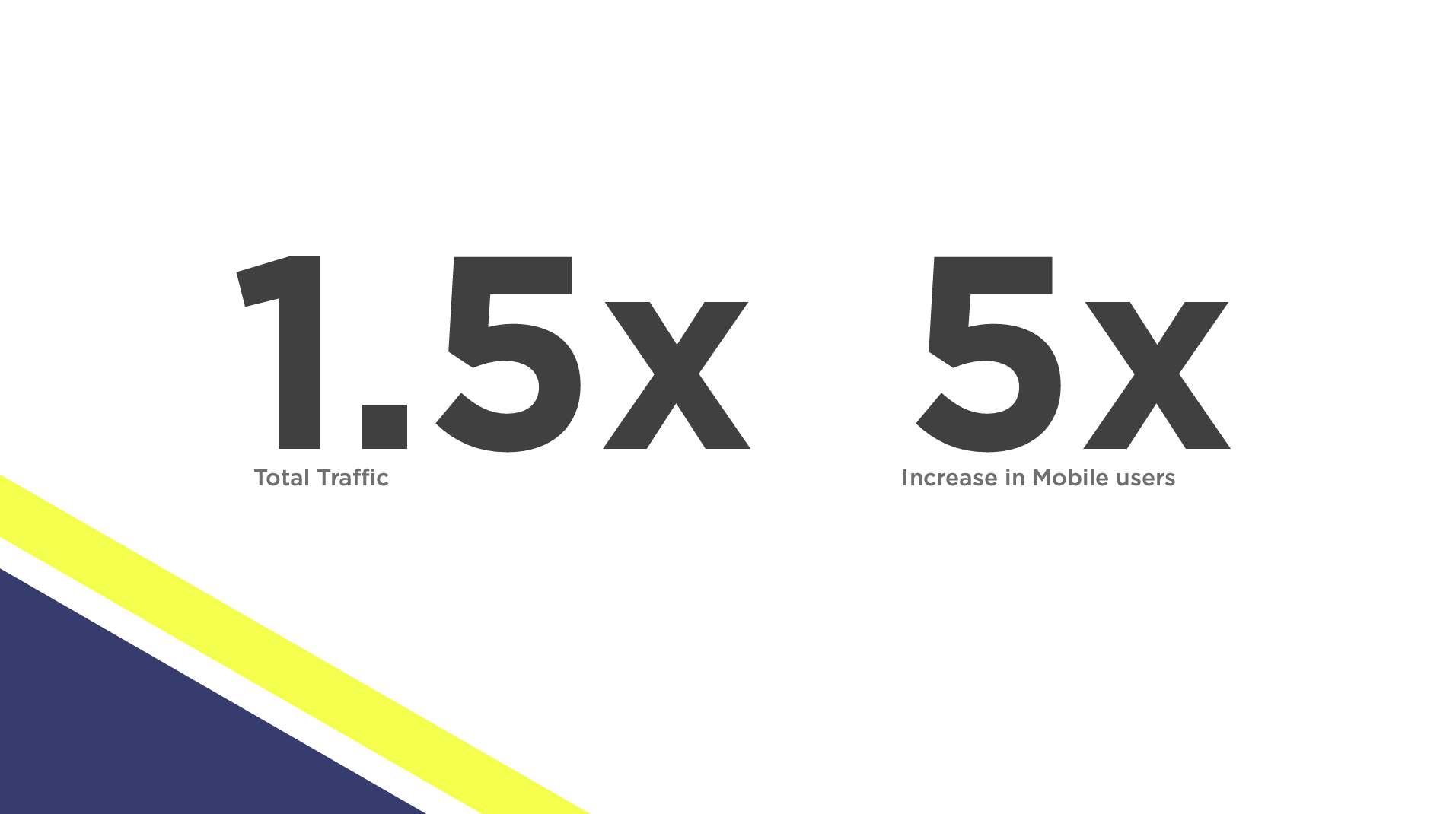
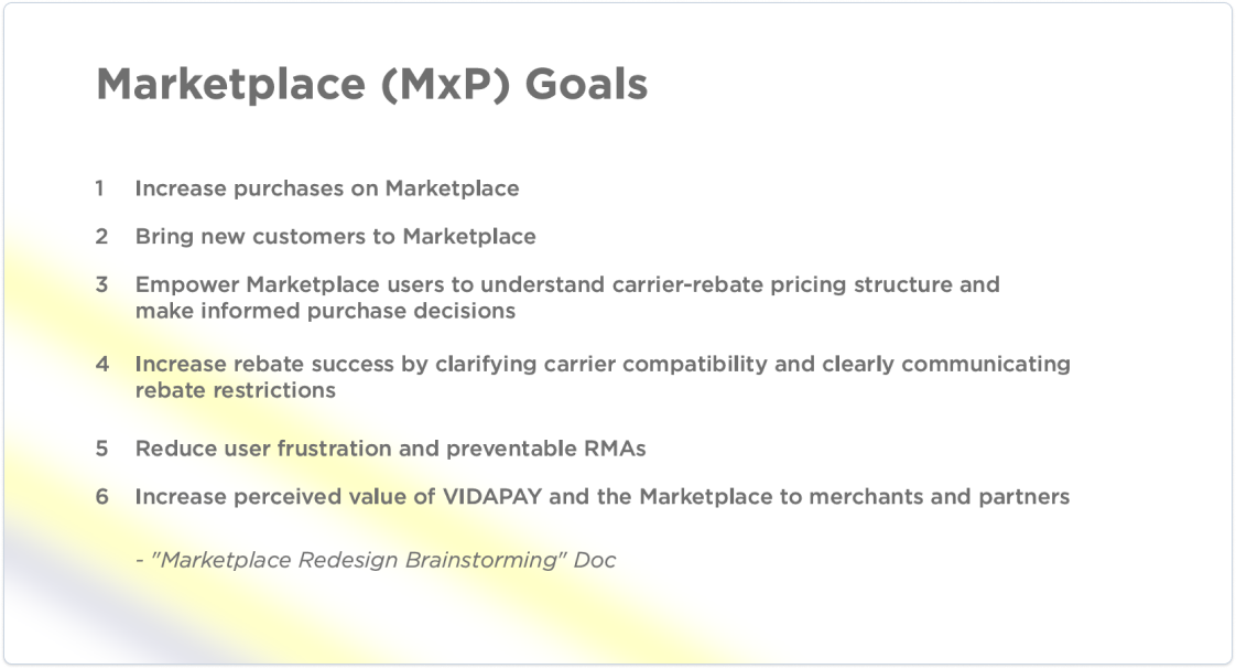
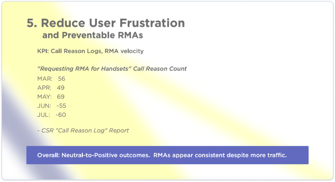
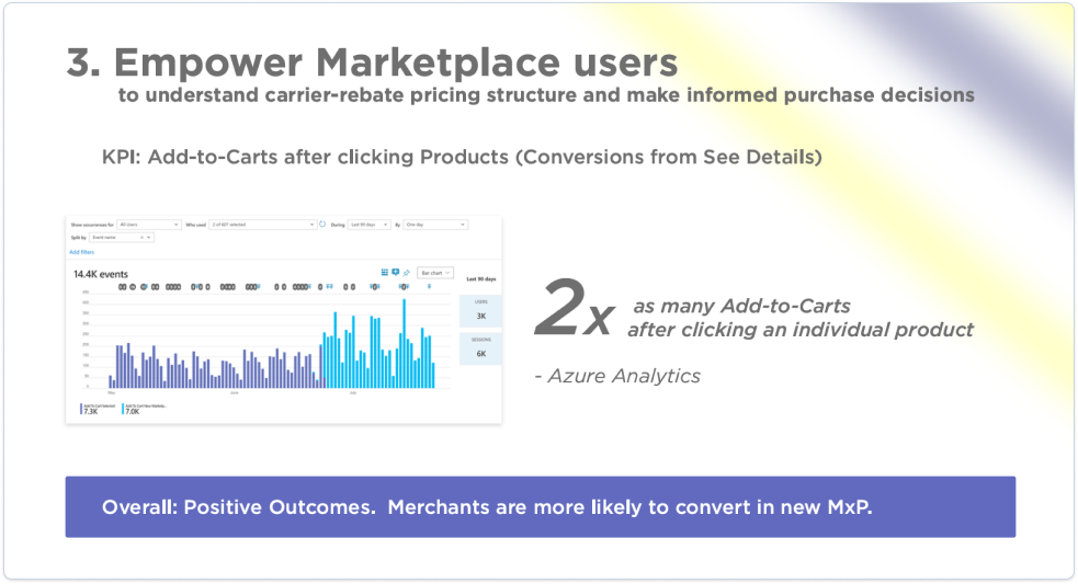
In short, the new Marketplace design was successful.
We observed no significant increase in Returns or
rebate failures attributable to the UI changes,
despite a substantial increase in overall
traffic.
The Marketplace design pattern
would continue to drive T-CETRA's business over the
next five years as other company verticals
experienced some difficulty. The project served as a
pattern for successful UX research practice
integration and how reliance on telemetry and user
feedback could guide design decision-making.
This
project also pioneered responsive and mobile-first
design practices, a new dev handoff process, and
improved UI documentation.
Post-Release Evaluation


Traffic, Conversions, and User Satisfaction all increased.
In short, the new Marketplace design was
successful. We observed no significant
increase in Returns or rebate failures
attributable to the UI changes, despite
a substantial increase in overall
traffic.
The Marketplace
design pattern would continue to drive
T-CETRA's business over the next five
years as other company verticals
experienced some difficulty. The project
served as a pattern for successful UX
research practice integration and how
reliance on telemetry and user feedback
could guide design decision-making.
This
project also pioneered responsive and
mobile-first design practices, a new dev
handoff process, and improved UI
documentation.