VIDAPAY Navigation Redesign
- B2B Portal - Navigation UX Research Cycle

- Portfolio
- VIDAPAY Navigation
Our layer-cake navigation isn't working anymore.
Time to update, streamline, and optimize!
Around 2019 we began to run out of room in the VIDAPAY site navigation menus to add all the new features we were developing. After a few stopgap solutions I successfully argued the need for a redesigned navigation experience.
With any luck we could reinforce a cycle of iteration and improvement for this major site feature that would be easy for everyone to pick up and run with later. We knew there would be new products and changes to account management, site-wide cart, etc. in the future, so it was important to have a plan different designers or dev teams could build on.
The cast of characters:


For starters, we would take a look at the usage statistics, user feedback reports, and check out
what alternatives there might be for managing nav menus.
Mostly Quantitative, carried out in Azure App Insights, Google Analytics, Hotjar, and internal database reporting tools.
Some of the many quantitative findings:
Devices - determining mobile user share, browser compatibility, and whether we should introduce
more mobile-first design patterns. VIDAPAY was well-understood to be a business-hours use case,
exclusively accessed in retail environments and on a PC. However - we were starting to get
word-of-mouth feedback from users that as owner/operators, they would like to be able to access
management tools and reporting on personal devices or outside of business hours. We adopted a
"build it and they will come" approach for an earlier E-commerce redesign, and after seeing
boosted mobile user rates there it seemed logical to ensure any navigation redesign would have a
mobile layout.

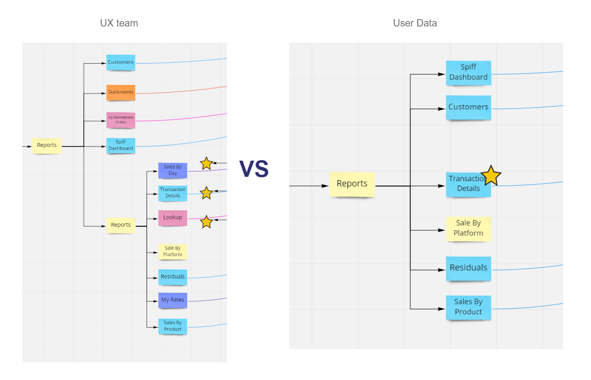
I ran some heatmapping and found the entire first layer of our 3-layer cake ("Account info") was getting clicks, but the "Merchant Tools" middle layer was seeing very low utilization. With this starting point I dove into the page traffic data for each of these navigation items and checked our telemtry and database call volume for the associated data.

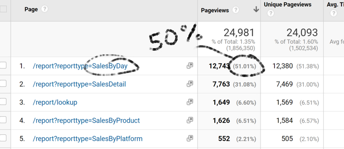
Although "Reports" was the most-clicked Tool in the navigation, it turned out that users were only after 1 or maybe 2 of the available reports; 50% of traffic went directly to "Sales by Day", indicating that there was a user desire for easier access to a daily wrap-up type of information. Maybe a homepage widget or a dashboard module could address that need in the future, but to begin it was sufficient to say there was consistent direct traffic intention for that page.
Mostly Qualitative, completed by surveying common patterns in a variety of adjacent industries and consulting with technical leads and other department stakeholders.
Some of the qualitative input:
Eugene collected
internal complaints and secondhand user feedback about the site navigation from our Sales and
Customer Service teams. We encountered a blindspot here; dealers really only called in to their
field sales reps or customer service when they had issues with a specific tool, and meta-level
site experience feedback like ease of navigation was less common. We decided to include some
questions aimed at clarifying user opinions about the nav in our later user testing phase.
We identified some different nav approaches in large commercial sites, aiming for B2C platforms with both a large product catalog and some services. This mix would theoretically represent our userbase and offerings. Eugene put together the comparisons and identified a few trends we could kickstart wireframing and ideation with.

We also wanted to get ahead of the product development cycle by theorizing a staged rollout of site navigation changes - business stakeholders had a belief that our users would be extremely sensitive to major site changes. Eugene worked on breaking the proposed nav changes into discrete stages we felt could be taken on piecemeal.
Competitive patterns
Initially our design instinct was hesitation at the idea of combining types of interaction and
destination in the menu. It seemed logical and natural that either every nav shortcut should be
a dropdown or none should, every item should go to a self-titled landing page and not a sub-page
element, every item in a cluster should be the same type of "business category" - all 'products'
in a 'products' tab, all 'services' in a 'services' tab, etc. etc. There was also technical
pushback to re-arranging elements outside of their database containers: returning "list of all
Product Categories" for the nav would be much, much easier dev than something more adaptable.
We found
that emerging practice was to cluster nav items roughly by 'type', but then to include similar
user task-oriented behavior items. For example, the "Watch" nav on apple.com would include all
the relevant watch "products" and related intangibles or
"services" a watch-browsing user might need or want: watch accessories, watch apps, watch
features. Pretty simple - don't let an arbitrary business or technical definition drive the nav
architecture, let user's goals drive the nav architecture.
We saw similar patterns in sites with more megamenu basis for their nav, but decided to
explore the apple model as a key inspiration. (Not just because "it's apple so it must be
right".) Their ribbon layer-cake with similar icon placement felt like an optimized version of
VIDAPAY and would carry a lot of familiarity for our users.
Other comparison points
like Lenovo were noticeably worse for "findability" despite using similar big icons and a nav
concept similar to our first instinct: "Products", "Services", etc.

Eugene would get started on the next steps for UI. We knew at this point nav items would probably be re-arranged to fit our "user goals" guidance, but it would take some research backing to justify any specific data structure.


We had a long pause on the project here while some business politics got sorted out and other projects took center stage. In the meantime, I set about planning and executing some research tasks so we could start to fill our placeholder "look and feel" concepts with real information architecture.
Eugene would get started on the next steps for UI. We knew at this point nav items would probably be re-arranged to fit our "user goals" guidance, but it would take some research backing to justify any specific data structure.
We had a long pause on the project here while some business politics got sorted out and other projects took center stage. In the meantime, I set about planning and executing some research tasks so we could start to fill our placeholder "look and feel" concepts with real information architecture.
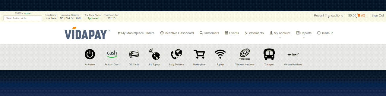
The VIDAPAY portal's original nav layout was defined mostly by system constraints and engineering's
best guesses at a logical category system. It was time to get users and their mental models in the
driver's seat.
T-CETRA's First Card Sort
None of the business, tech, or
project management team had used a card sort before.
It's always difficult to present UX research to business and to hammer home concepts like "you are
not your users" when they don't have first-hand experience with the methods, so I roped a few
business team leaders and customer service reps into participating in a card sort exercise over
lunch.
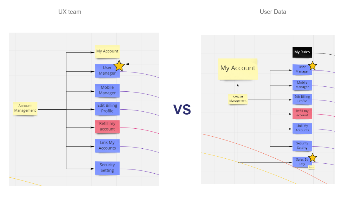
Later I would present their results (and the current nav structure) side-by-side with what users
chose themselves when given the opportunity. We ran two card sort studies externally with similar
user groups, one open and one closed.
Here's some of that later presentation.
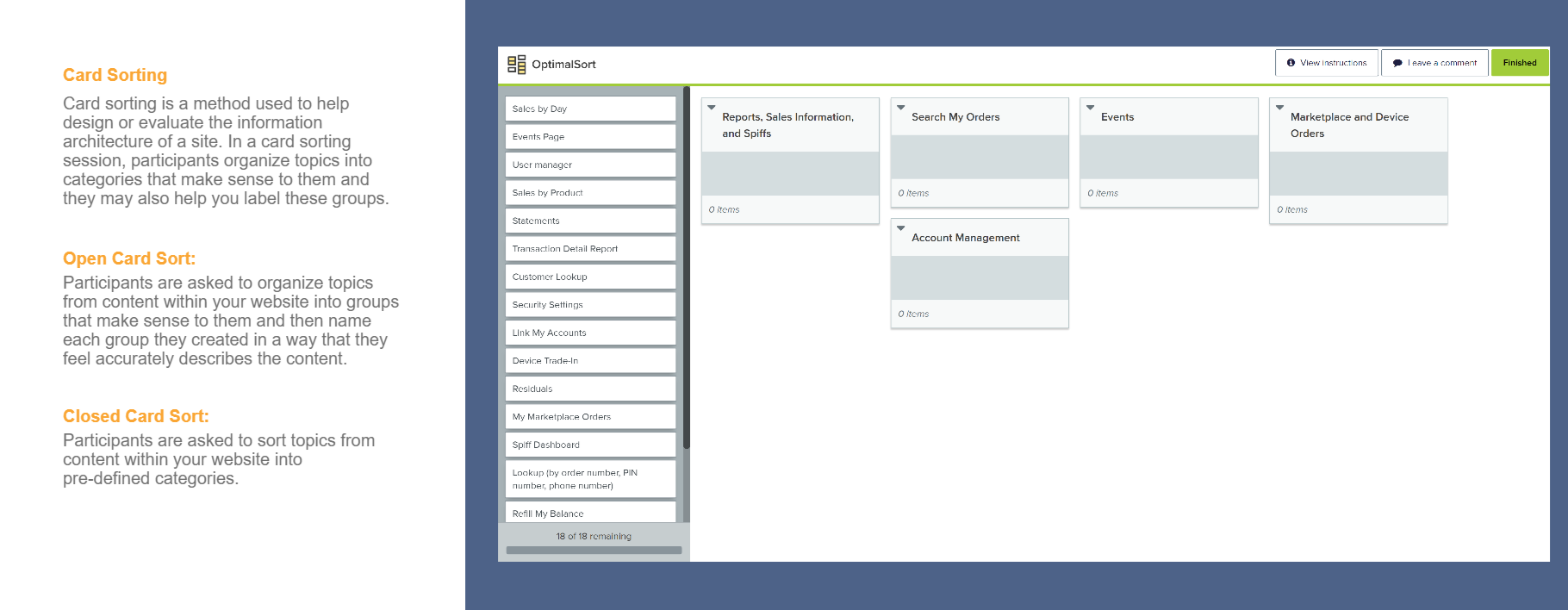
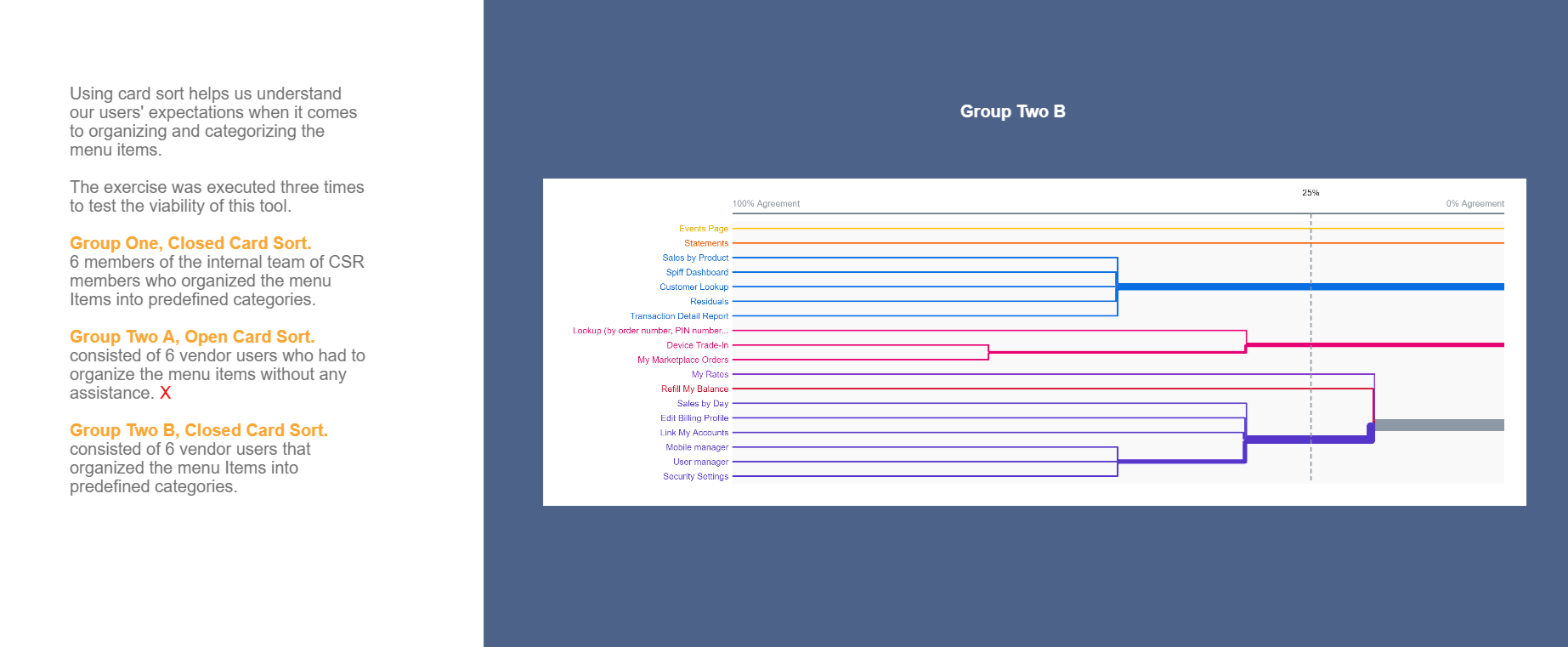
Actual participant groups were small - 6 each - since this was a pilot study. NNG suggests that's
enough to gather basic conclusions.
Findings
Our internal business participants identified
something in their key practice area that could be improved. Usually that meant surfacing a specific
link or feature more obviously, but left most of the other nav "as-is".
Our external users simplified the menu tree and forgot to place or skipped tools and features they
didn't use frequently. Many put together a menu tree that looked more like a flat list of everything
they recognized by name, but nothing else. Several indicated they normally just clicked on icons and
barely remembered what the text read or what the tool was called. (We noted this for later - more
images and bigger icons!)
It was tricky to take a clear-cut conclusion from the
small samples and contradictory placements.
Key takeaway: users tended to be laser-focused on things relevant to their
specific needs.
If we could find a way to highlight key items on a contextual, per-user basis - the rest of the nav could be complex without hindering usability.
Ideally, we would run this with bigger groups and start tree-testing some of our outputs to really
put some quantitative groundwork underneath the decisions.
In practice, it was time to go visit
the VP of Software Development and Lead Architect to see how viable dynamic information in menus
would be.
Two main factors influenced the next round of UI revisions as we introduced dynamic
information.
First, I led a study to find out what our number of product suggestions
should be, assuming we could populate a menu with "top products" or a similar filter. Merchant
data showed that our users typically had a top carrier at 50-80% of their business, then up to
two additional carriers at 10-30%, then a long tail of infrequently used carriers. Top 3 should
cover it.
Secondly, we moved to more of a mega-menu influenced layout. Though it
would demand more space when expanded, we could eliminate an entire "ribbon" of UI when closed -
and more importantly, we could skip an entire interstitial screen by letting users directly
select their destination.


This new mega-menu direction opened up some interesting hierarchy decisions and messaging
opportunities. If Carrier A had a special deal going, should we show it in the menu? If a user
had 2, or 4 or 5 top brands, should we show 2 or 4 or 5 instead of 3?
Most
importantly, it was a significant departure from both the Layer-Cake layout and existing screen
flows. Users could skip a screen - but would they find that intuitive?
Two main factors influenced the next round of UI revisions as we introduced dynamic
information.
First, I led a study to find out what our number of product suggestions
should be, assuming we could populate a menu with "top products" or a similar filter. Merchant
data showed that our users typically had a top carrier at 50-80% of their business, then up to
two additional carriers at 10-30%, then a long tail of infrequently used carriers. Top 3 should
cover it.
Secondly, we moved to more of a mega-menu influenced layout. Though it
would demand more space when expanded, we could eliminate an entire "ribbon" of UI when closed -
and more importantly, we could skip an entire interstitial screen by letting users directly
select their destination.
This new mega-menu direction opened up some interesting hierarchy decisions and messaging
opportunities. If Carrier A had a special deal going, should we show it in the menu? If a user
had 2, or 4 or 5 top brands, should we show 2 or 4 or 5 instead of 3?
Most
importantly, it was a significant departure from both the Layer-Cake layout and existing screen
flows. Users could skip a screen - but would they find that intuitive?
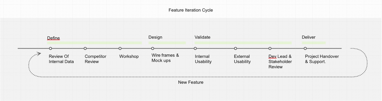
Tuning and Testing
It was important to move into
prototyping at this stage for a few reasons:
I planned to usability test the new menu
concept to vet it's performance, but it would be difficult to get accurate user judgements on "feel"
and "speed" without having all the interactions in place. Hover-expand, page-to-page transitions,
possible target size or cursor movement issues - although we could show static screens or wires to
get an initial opinion, it seemed prudent to test at a similar level of fidelity to the UI users
would already know to prevent false negatives.
The more important piece was that ... I
didn't know yet how those same interactions - hover animations, active and focused states, etc. -
would behave, because we didn't have a precedent in the design system at this point for sub-menus.
Prototyping at high-fidelity would be a good way to establish our animation for menus and wouldn't
be overly taxing because of the limited scope of the menu.
The full UX team contributed to the look-and-feel of menu visuals, then Eugene tackled building out
the protoype with our final styling to include first funnel steps for all the clickable menu items.

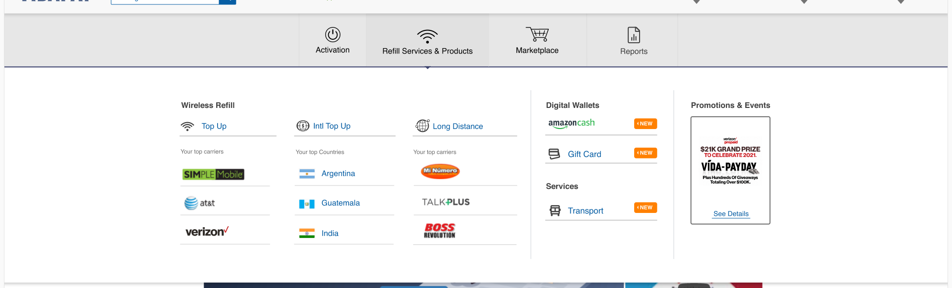
Prototype Ready
Our test-ready design expanded the menu
background container to full-width, re-stacked the mobile version's sub-sections, integrated more
images and icons, and brought in more divider lines.
We prepared "widget" space in the layout to provide marketing or business a predicatable asset and
to forestall big changes to the site nav itself later down the line to promote something.
I
negotiated with the tech team to prepare step-by-step improvements to our data handling; we could
start with static "top products" that would be the same for all users and expand to dynamic for all,
dynamic for groups, and finally dynamic for each user.
The vertical columns of the
mega-menu gave us good mobile wrap points and some potential for future product expansion, and the
grid layout always saved room on the right margins for tags like "NEW".
Prototype Limitations
Our approach with XD components
did lead to some sluggish response and issues with hover targets, but the prototype was smooth
enough to test basic behavior on some users in controlled environments.
Good news: we had a testable prototype.
Bad news: I had no budget for testing at
scale.
Here's how I managed a shoestring UXR operation:

Leverage available resources outside the team
I was
able to work with our Dealer Outreach team - normally part of our support call center ops - to
recruit participants. All I had to do was provide a call script!
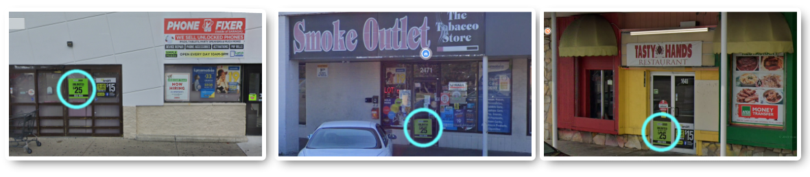
Find representative samples
We filtered down store
owners close to the T-CETRA HQ by their market segment, making sure we could cover a
representative sample of predicted use cases nation-wide. International grocery, Smoke shops,
and Wireless stores were the core audiences targeted - anywhere with the green sign.
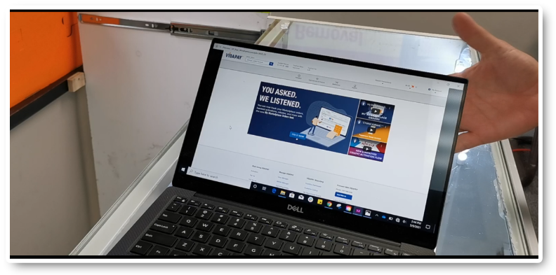
Test local, test in-situ - bring the test to the users.
The fact is that a small business owner-operator will be tough to get out from behind
their counter, and asking them to spend a half-day closing their business to customers to
participate in a test would be insensitive and impractical. This also meant no catering, big
compensation packages, travel reimbursement, etc. - but testing proved chaotic and less
controlled than in a lab setting.